AIO Terminal's most comprehensive update yet: the old "Order Book" tab has evolved into a full-featured Analytics tab — a complete market microstructure dashboard with 7 live data panels, all streaming in real time from Binance WebSocket. This article walks you through every component, how to read it, and how to combine the signals in a practical trading workflow.
Why a Dedicated Analytics Tab?
Most futures traders make decisions using lagging indicators on a price chart alone — moving averages, RSI, MACD — tools that describe what already happened. Market microstructure tells you what's happening right now: where the liquidity sits, who is aggressive, whether futures players are leading spot, and what the risk environment looks like at the macro level.
The Analytics tab was built to answer these questions without requiring multiple subscriptions, browser tabs, or specialized hardware. Everything you need is in one place, in the same interface where you execute.
The 7 Components: What Each One Does
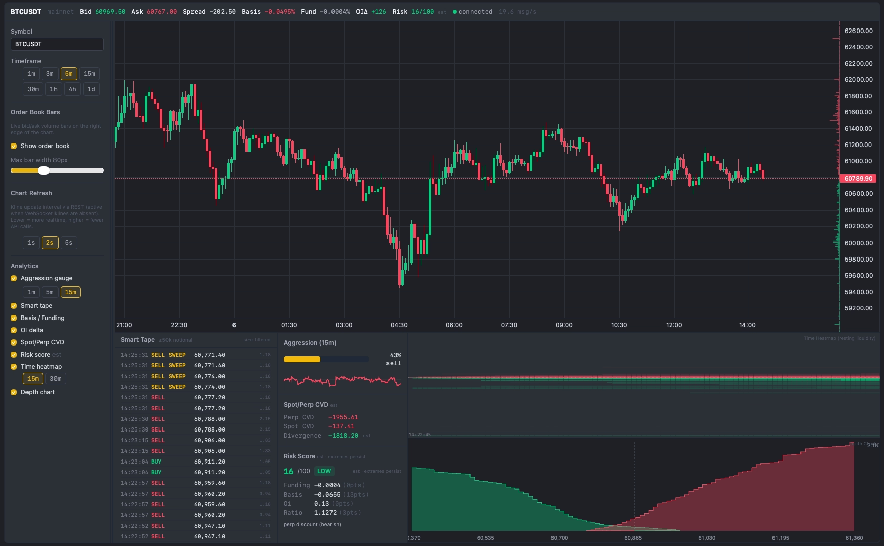
1. Chart + Order Book Bars
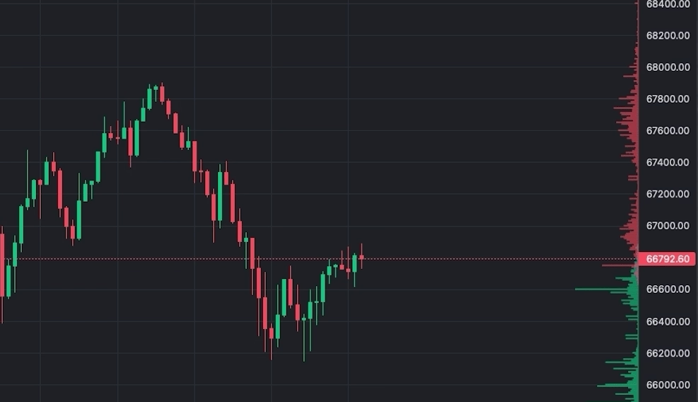
The Analytics tab opens with a full TradingView Lightweight Charts candlestick chart. On the right edge of this chart, live bid and ask bars are overlaid — each bar represents the total resting quantity at that price level. The normalisation is absolute-max: the widest bar on screen equals the highest liquidity level currently in the order book. All other bars are scaled relative to that maximum.
This makes whale walls immediately visible. When one price level has a bar that's 3–4× wider than its neighbors, that concentration of resting orders is significant. The bars update every 100ms from Binance's official @depth WebSocket stream — faster than any TradingView indicator can refresh.
- Green bars (left of mid price): Bid orders — buyers waiting to buy below current price
- Red bars (right of mid price): Ask orders — sellers waiting to sell above current price
- Configurable width: Adjust from 30px to 200px depending on how prominent you want the overlay
2. Cumulative Depth Chart
Below the main chart, the Depth Chart panel shows the cumulative total of resting orders on each side. The green curve represents total bid volume at each price level and below; the red curve shows total ask volume at each price and above. Where the two curves converge at the center, that's current mid price.
Reading the Colors
The Depth Chart uses a clear two-color convention:
- Green curve (left side): Cumulative bid volume — total resting buy orders from current price downward. Moving left along the green curve, each point shows the total buy-side depth available down to that price.
- Red curve (right side): Cumulative ask volume — total resting sell orders from current price upward. Moving right, each point shows how much sell-side supply must be absorbed to push price to that level.
- Where they meet (center): Current mid-price / spread. The gap between the left edge of the red curve and the right edge of the green curve is the bid-ask spread.
Reading the Depth Chart tells you the macro structure of liquidity rather than individual levels:
- Steep green or red curve near mid: Thick liquidity close to current price — small to medium orders won't move price significantly. A steeper green curve vs. red means more buy-side depth near mid (buyers are more committed at current levels than sellers).
- Flat "cliff" zones: Very thin liquidity at those price levels — if price enters this zone, it can gap quickly. These are targets for price to run to once a wall is absorbed.
- Green curve rising faster than red: Buyers have more cumulative depth close to current price than sellers — bullish near-term imbalance. The market has more committed buy orders than sell orders at comparable distances from mid.
- Red curve rising faster than green: More sell supply stacked above than buy support below — bearish near-term structure.
3. Aggression Gauge
The Aggression Gauge shows the buy/sell pressure ratio over a rolling 1-minute window, expressed as a 0–100 score updated every ~1 second. A value of 50 indicates a perfectly neutral balance of buying and selling aggression. Values above 65 indicate sustained buy-side pressure; values below 35 indicate sell-side dominance.
The gauge also displays a 15-minute sparkline — a small time-series chart of the last 15 minutes of aggression readings. This lets you see not just the current state but whether pressure has been building, fading, or oscillating. A gauge that climbs from 45 → 72 over 10 minutes tells a very different story than one that spikes to 72 for 30 seconds and drops back.
Practical use: Before entering a breakout trade, check whether aggression is already elevated on the breakout side. A breakout with aggression > 70 is momentum-backed. A breakout with aggression at 48 is likely a false break — there isn't genuine pressure behind it yet.
4. Smart Tape
Smart Tape filters the real-time trade stream and shows only trades above a configurable notional threshold (default: ≥ 50,000 USDT). This eliminates retail-size noise and surfaces the trades that move markets. Each entry shows: side (BUY/SELL), size in USDT, and timestamp.
Critically, Smart Tape detects sweeps — three or more large same-side trades within a 500ms window — and flags them in yellow: ⚡ BUY SWEEP or SELL SWEEP. The tight 500ms window means a sweep only fires when a participant hit multiple price levels within half a second — genuine urgency, not just coincidence. This is one of the highest-conviction real-time signals available in market microstructure.
- Single large trade (e.g., $250k BUY): Elevated interest, but could be a hedger or position builder — not conclusive alone
- BUY SWEEP (3+ large buys within 500ms): A participant is executing with urgency, willing to pay up. This is directional conviction
- SELL SWEEP: Aggressive distribution — someone needs out now, not at the best possible price
The min-size threshold is a sidebar dropdown with five presets: $25k / $50k / $100k / $200k / $500k (default: $50k). Your choice is saved automatically. Use $25k for lower-cap assets (SOL, LINK) where $50k+ trades are rare, or raise to $200k+ when you want to track only large institutional clips on BTC.
5. Spot/Perp CVD Divergence
CVD (Cumulative Volume Delta) tracks the net difference between buy-side and sell-side volume, anchored to the session start. AIO Terminal calculates CVD for two markets simultaneously: USDⓈ-M Futures (perpetual) and Spot. The divergence line shows the difference: Perp CVD − Spot CVD.
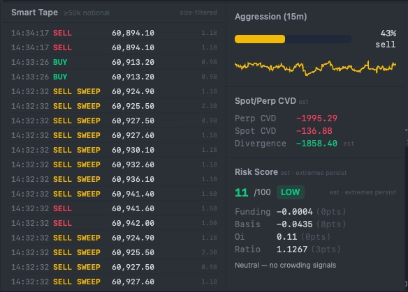
When perp CVD is rising faster than spot CVD, futures traders are accumulating ahead of spot buyers — a historically bullish signal. When perp CVD diverges negatively from spot (futures selling while spot holds), futures traders may be distributing or hedging while retail spot buyers provide the liquidity for exits.
The key signal is divergence, not level. Both CVDs are session-anchored, so their absolute values reset each day. What matters is when the two lines separate: futures leading spot higher (institutional long buildup) or futures leading spot lower (institutional short buildup or distribution).
6. Risk Score
The Risk Score is a 0–100 composite signal derived from four macro-level Binance data sources, updated every 5 minutes:
- Funding Rate: Extreme positive funding (longs paying shorts heavily) indicates overleveraged longs — elevated reversal risk
- Open Interest Delta: Whether OI is growing or shrinking relative to recent history
- Basis: The spread between futures price and spot price; a high positive basis signals elevated futures premium
- Long/Short Ratio: The proportion of accounts currently holding long vs. short positions
A low Risk Score (0–30) suggests a relatively safe market structure for directional longs — funding is neutral, OI is reasonable, basis is tight. A high Risk Score (70–100) suggests elevated risk: crowded longs, high funding costs, stretched futures premium. This is when leveraged long positions are most vulnerable to a sharp flush.
Note: The Risk Score is advisory — it does not trigger any automated actions in AIO Terminal. It is a contextual signal to weight alongside your other analysis.
7. Time Heatmap
The Time Heatmap is a Bookmap-inspired visualisation of resting liquidity across both price and time. Rather than showing the order book at a single instant, the Time Heatmap accumulates snapshots over the session and renders them as a 2D heatmap — brighter/larger cells indicate where large resting orders have been concentrated most consistently over time.
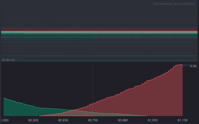
Reading the Colors
The Time Heatmap uses a two-color system directly from the order book:
- Green cells: Bid orders — resting buy limit orders waiting below the current price. Brighter/more intense green at a price level means larger total bid volume has been parked there. A persistent cluster of bright green below current price is structural support — real buyers have been holding that level.
- Red cells: Ask orders — resting sell limit orders sitting above the current price. Bright red concentrations above current price are resistance zones where sellers have been persistent.
- Intensity = relative volume: Brightness is normalised to the maximum volume in the current window. A brighter cell does not mean an absolute amount — it means the largest resting orders in the current session are concentrated there.
So yes: more and brighter green below current price = more resting buy limit demand at those levels. A thick green band that has held for 15–30 minutes is a structurally supported bid — the market has repeatedly placed orders there rather than letting it thin out.
Practical reads from the Time Heatmap:
- Persistent bright line (green or red): A "whale wall" — large resting orders that have been there consistently. Likely acts as support (green) or resistance (red) for short-term moves.
- Bright line that suddenly disappears: The wall was absorbed or cancelled. If green: buyers either filled against price or pulled their bids. If red: the ask wall was absorbed by aggressive buyers (bullish) or was pulled (possible spoof).
- Sparse, faint heatmap: Thin liquidity across the book — wider spreads, higher slippage risk, faster price movement through levels.
The heatmap window is configurable (15 or 30 minutes). Enabled via Settings → Show time heatmap (off by default).
How to Use the Analytics Tab: A Practical Workflow
Pre-Trade Context Check (2–3 minutes before entry)
- Risk Score: Is it above 70? If so, reduce leverage or skip longs entirely. High-risk environments flush leveraged positions without warning.
- Spot/Perp CVD: Is perp CVD trending the same direction as your intended trade? Confirmation from futures flow adds conviction.
- Time Heatmap: Identify persistent liquidity clusters near your entry and target. A thick wall near your intended stop suggests placing your stop beyond that level.
- Depth Chart: Is there a thin zone between current price and your target? Thin zones accelerate price movement — this supports a wider target.
Entry Timing (real-time, 30 seconds before)
- Aggression Gauge: Is pressure building in your direction? A gauge rising above 60–65 on a breakout confirms real pressure is behind it.
- Smart Tape: Any large trades or sweeps confirming your side? A BUY SWEEP just before your intended long entry is validation. Multiple sweeps in the same direction within a few minutes is institutional position-building.
During the Trade (monitoring)
- Watch the Order Book bars near your stop level. Is the bid cluster supporting your long still thick, or being absorbed?
- Watch Aggression. If it starts dropping while you're in a long, buying pressure is fading — consider tightening your stop.
- Watch Smart Tape for large SELL trades or SELL SWEEPS against your direction — institutional players distributing into your move.
Configuration Tips
- Symbol & Timeframe: Set to your primary trading pair and preferred candle interval. Order Book data streams regardless of candle interval.
- Smart Tape min size: Use the sidebar dropdown to choose from $25k / $50k / $100k / $200k / $500k presets. The default $50k works well for BTC. For lower-cap assets (SOL, LINK, DOGE) use $25k. For a pure institutional-only view on BTC, raise to $200k.
- Time Heatmap window: A 30–60 minute window balances recency with enough history to identify persistent walls. Adjust shorter for scalping or wider for swing trading context.
- Show/Hide panels: Each panel (Order Book bars, Depth Chart, Time Heatmap) can be toggled independently. If screen space is limited, hide what you're not actively using.
All settings are saved automatically in localStorage — your configuration persists across sessions.
How the Analytics Tab Compares to Dedicated Tools
Bookmap, Exocharts, and similar standalone tools offer deep microstructure visualisation — but they are separate subscriptions, separate windows, and separate execution interfaces. The workflow tax of switching between tools during a live trade is real: by the time you read the signal in one tool and act in another, the window may have closed.
AIO Terminal's Analytics tab is not positioned as a replacement for professional microstructure tools at the same depth. It is positioned as the right tool for the job when you want actionable microstructure context inside the same interface where you execute. The signal that matters most is the one you can act on immediately — and that's what the co-location of Analytics and execution tabs enables.
AIO Terminal: Analytics Tab Included Free
The full Analytics tab — all 7 panels — is available to all AIO Terminal users at no additional cost. Access is included with every VIP plan. Contact us on Telegram to get your terminal credentials.
See Analytics Tab Overview →Getting Started
If you're already an AIO Terminal user, press key 8 (or click the Analytics tab) to open the Analytics panel. Select your symbol and interval — the data streams immediately. No additional setup required.
If you're new to AIO Terminal: access is included free with any VIP plan. After subscribing, contact us on Telegram (@nguyenthl) to receive your terminal credentials. Setup takes approximately five minutes.
For a deeper dive into specific Analytics components, see the related articles below.